Our weekly Dev update from the MechWarrior Tactics team takes a slight twist this week. Â Instead of a look at a specific card type.. Â We got a ‘primer’ on MWT, what it is (and isn’t), as well as a very high level overview of some of the systems.
The link to the post over on the official forums is here.
This blurb does a great job of telling you what MWT will be:
What is MechWarrior Tactics?
- Asynchronous, F2P turn-based strategy game set in the MechWarrior Universe
- Collectible and customizable forces
- Playable on most major browsers using the Unity Engine plug-in
- Giant ‘Mechs blowing the scrap out of each other every which way
There’s more good stuff in that section (difference between scrap (you earn it), and C-Bills (You buy them) for example, as well as some brief discussion on how MWT will avoid being Pay2Win.
The most exciting stuff though, comes with pictures! Â Because it’s a bit lengthy, it’s after the jump!
We get our first glimpse at a very improved “STAC browsing/opening” screen. Â This is what you’ll see after you spend your scrap, to buy your STACS. Â The last glimpse we had at this screen, it looked kinda plain:
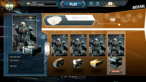
You’ve got the same artwork for each STAC, and just the color of the container below the card, to tell you which STAC you’re opening. Â You also don’t have anyway to open more then one STAC at a time.
The tease we got from the team today, shows huge improvement in this aspect:
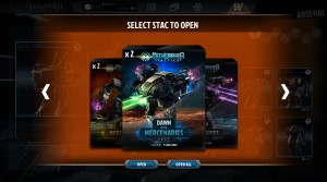
This is the ‘new’ STAC screen, you can see that there is different artwork on each STAC type, and we have an ‘open all’ button, useful if you just bough 3 or 4 of each STAC.
The STACs also now tell us what ‘set’ they’re from (Note, the “Dawn of the Mercenaries” is just a test name. Â They also tell you the quality of the STAC, as well as the number of cards in the STAC. Â After clicking ‘Open’, you’ll go to the ‘viewing’ screen, and get to see what cards are in the STAC you just opened.
We also got a shot of the Arsenal screen, which is your inventory (‘Mechs, Weapons, Armor, Cosmetics, etc.. all will be on different pages here). Â The biggest change on this screen from the PAX shots, is the ability to sort, and search through your Arsenal! Â This will be very handy for folks with large collections.
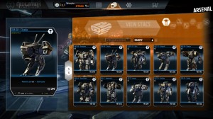
The icons across the top are (from left to right) ‘Mechs, Weapons, Equipment (Core Tech), Armor, Pilots, Cosmetics, and finally Ammo. Â You can search by entering the name of the card you’re looking for, and sort ascending, or descending based on card rarity. Â Again, this will be very helpful as we all start accumulating hundreds of cards.
Next up is Mission Control!
This seems to be the ‘central’ area for doing anything (except buying/opening STACs). Â From Mission Control you can launch a new mission, and access the ‘MechBay to customize your units.
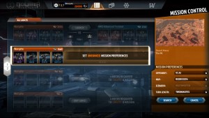
This shot shows that we’ve got room for 4 Lances. Â The first lance is in a match vs the AI, and is presenting the ‘launch’ option. Â The second lance, is in the process of starting to find a match (two types of matches, ranked and unranked). Â We’ve selected to look for an unranked match. Â On the right, you can see the different options you have for setting up a match. Â This match will be against the AI, on the RedRock14 map (which, based on the image above it, is a desert pit). Â With the scenario of deathmatch, with two minute turn times. Â Make sure you read the information about HOW the match making will work.. it sounds like it will keep things pretty close, so you shouldn’t end up with your lance of Jenners, against a lance of Awesomes.
I’m going to skip the ‘Mechbay shot, as we received that sneak peek in one of the earlier dev articles as well.. it still looks great!
Chris goes on to talk about how the MWT turn system works (Attack, Movement, Resolution). Â But, I’m more interested in the pretty pictures ;)
The in-match UI has received a HUGE overhaul, and it looks much more user friendly, and informative then the old one.
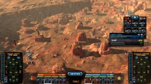
The “Lance bar” has been moved from the left edge, down to bottom center, along with the ‘end phase’ button.. this looks like it should make it much harder to accidentally click the ‘end phase’ button. Â The old map, the ‘end phase’ button ended up almost in the middle of the screen, which looks like you’d accidentally click it pretty easily.
The “Paper Doll” for your ‘Mech, and your target’s, has been improved..the heat scale next to it, now also has the ‘heat sink’ icon to show how much heat you’ll dissipate each turn. Â Presumably, the pilot/weapon icons on the paper dolls, will show you the status of your pilot, or weapons, when clicked.
Most useful, will be the information on the weapon cards in the upper right. Â Those display when you’re targeting an enemy ‘Mech. Â The previous screens, just showed the final to hit chance. Â These, show you what modifiers are affecting that to-hit chance.
The red line going down the middle of the map, indicates that the Catapult (unpainted on the left), will be firing on the Commando on the right. Â That line should be useful for determining if something is blocking your line of sight to your target.
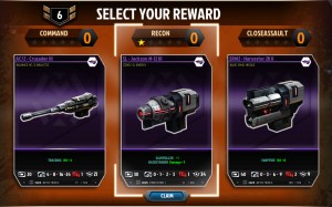
All very good information… but, Chris didn’t stop there.. he sprung on us a surprise! Â There will be XP, and you will rank up by playing!
It looks like as you go through a ‘skill tree’ (for lack of a better word). Â As you go up the tree, you get granted a card beneficial to that tree.. Â We didn’t get a lot of detail, but it sounds like it will be a fun progression, and should keep people playing for a long time.
Between this, and the previous Dev “Intro to XXXXX” posts we’ve received over the last few weeks…it’s very obvious that the Dev team is making a LOT of progress on the game, and they have improved it nicely. Â Very much looking forward to release!
